Showing posts with label Webpack. Show all posts

Monday, 2 September 2019

Create SPFx Library components containing Office UI Fabric React

When using Office UI Fabric React (OUIFR) components in SPFx projects, if you analyse the bundle structure you will notice that OUIFR components take up a lot of space which leads to increased bundle size.

If there are multiple SPFx components loaded on the page which depend on OUIFR components, the size of each bundle will be affected, as by default the OUIFR components are included in each SPFx bundle.

One way to mitigate this issue is to include all your custom components (which depend on OUIFR) into an SPFx library component and then consume the library component from SPFx webparts and extensions. This will make sure that if you have reusable custom components, they won't be loaded multiple times on the page if multiple SPFx webparts (or extensions) are consuming them.

Let's see how to achieve this. We will be working with SPFx 1.9.1 which contains the GA version of Library Components:

1) Create SPFx Library and Consumer component structure


First, make sure you have an SPFx library project as well as a "consumer" SPFx project containing webparts (or extensions). Instructions on how to create this are in the Microsoft docs: https://docs.microsoft.com/en-us/sharepoint/dev/spfx/library-component-tutorial

The code for this post is also available on GitHub if you want to have a look: https://github.com/vman/spfx-lib-components-ouifr


2) Create a new custom react component which internally uses Office UI Fabric React


In the library component project, create a new react component in a new file e.g. ButtonComponent.tsx


Here are the contents of the custom react component:


3) Update the index.ts file


In the index.ts file of the library component, include the new component to be exported:


4) Update config.json


Next, in the config/config.json file of the library component, make sure that the entry point is pointing to /lib/index.js


This step was not necessary in SPFx 1.8.2-plusbeta but seems there is a bug in SPFx 1.9.1. I have created a GitHub issue here:

5) Update the consumer web part


Make sure that the library component is referenced in the consumer webpart e.g. through npm link or by using a monorepo manager like rush or lerna.

More details on using npm link in this in the Microsoft docs: https://docs.microsoft.com/en-us/sharepoint/dev/spfx/library-component-tutorial

And finally, in your consumer SPFx react webpart, you can reference the custom component:


When you deploy both the SPFx packages in the app catalog and then add them on a page, you will see different bits of code being loaded separately:
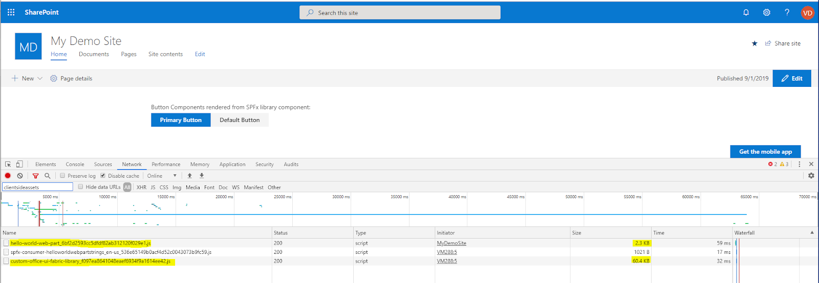


And that's it! Sample repo on GitHub: https://github.com/vman/spfx-lib-components-ouifr

Wednesday, 12 December 2018

Code Splitting in SharePoint Framework Part 2: Optimizing the SharePoint Starter Kit

I was having a look at the SharePoint Starter Kit recently and I have to say it's a very useful collection of sample SPFx webparts, extensions and other modern SharePoint building blocks. You should check it out if you haven't already.

While I was looking at the different components, I noticed something interesting: When I created a production package and observed the minified JavaScript files, the file-sizes were bigger than expected.

(Note that these are just the sizes when the files are extracted on the file system. When they are included in a package and loaded on SharePoint pages, they will be compressed so their sizes would be smaller. The image is just to help compare the file-sizes after the optimisations)


So I started having a closer look at the SPFx components and noticed a few interesting things:

1) @pnp/sp: 


As expected, many of the components were using the @pnp/sp package but each component was statically importing it. This meant that each component will have a copy of @pnp/sp in its individual bundle:

The solution was to implement code splitting and separate out @pnp/sp into it's own file:

This approach has two benefits:
  • All components share the same @pnp/sp bundle
  • The @pnp/sp code is loaded dynamically on the page only when required

2) @pnp/spfx-property-controls


The @pnp/spfx-property-controls package is great when it comes to having pre-created custom controls to use in the SPFx webpart property pane.

One thing worth noting though is that the property pane is loaded much less frequently than the webpart code itself. The property pane is used only to configure the webpart so the code is only needed then and not when the web part loads normally on the page.

To further optimize the webpart bundles, we can separate out the property pane code (including the components from the @pnp/spfx-property-controls package) and load it on the page dynamically only when the property pane is loaded.

So instead of statically importing the property pane components like this:

We could dynamically import them:

This would also mean that the property pane custom controls will be split into their own JavaScript bundles and multiple webparts using the same type of control will share the code:


This is particularly helpful with controls like `PropertyFieldCollectionData` which is more than 700kb in uncompressed format!

After implementing both these changes, we can see that the file sizes have been considerably reduced:


Also important to note is not only the filesize reduction, the main benefit of this approach is that there is no duplicate code in the components.

I have submitted a Pull Request with these changes to the SP Starter Kit GitHub repo if you want to checkout the code:
https://github.com/SharePoint/sp-starter-kit/pull/216

Here is a link if you want to checkout the official Microsoft docs on dynamic loading of packages:
https://docs.microsoft.com/en-us/sharepoint/dev/spfx/dynamic-loading

Thanks for reading!

Monday, 8 October 2018

Code Splitting in SharePoint Framework (SPFx)

Code splitting is not a new concept to TypeScript/React/Webpack developers. In short, it is a optimisation technique which allows us to split our application bundle into smaller bundles and load them on-demand only when required.

E.g. when a React component or a third party package is only needed when the user clicks on a certain button, then there is no need to load in on the first page load. It can be fetched on-demand when the button is pressed. This reduces the amount of data fetched over the wire on first page load, thus improving performance and user experience. This can be particularly helpful in large applications with many third party packages and components.

In this post let's have a look at how to do code splitting in the SharePoint Framework. As an example, I am going to use an SPFx web part created using React but the code splitting approach can be used with other frameworks/libraries as well.

We are going to have a look at two scenarios where code splitting can really help:

1) Loading a React Component on-demand (where we load the DetailsList component from Office UI Fabric)

2) Loading a third party package on-demand (where we load the infamous-for-its-large-size moment js)

So to begin with, here is my render method of a React component created by default by the SPFx yeoman generator:

I have edited it to show only 2 buttons. This component will be our "main" component which will load other components and third party packages when a user clicks on the relevant button.

Load a React Component on-demand: 


The _loadDocumentsClicked function will fire when the user clicks on the Load Documents button. The DetailsList component is defined in a file called DetailsListComponent.tsx which is in the same folder as the main component.

Once the import function fetches the DetailsList component class, we create an an instance of the class and use ReactDom to insert the component to the detailsContainer div in our main component. 

Load a third party package (moment js) on-demand:


Similarly, the _loadMomentClicked function will fire when the load moment js button is clicked. it will fetch the moment package and then assign the value of moment().calendar() to a property in the current component's state.

And here is the code in action on a modern SharePoint page:

(click to zoom)

What is also important to note is that the bundle will be loaded only if it was not loaded earlier. The import function is smart enough to determine if the bundle is already downloaded and it does not request it again.

Hope you found this useful!

As always, the code for this is available on GitHub: https://github.com/vman/SPFxCodeSplitting

Friday, 7 July 2017

Including only required Babel polyfills with Webpack

If you are using something like Object.assign or Promises in your ES6/TypeScript code, you will sooner or later come across the fact that IE11 does not support them natively. In such cases, the natural way forward is to include a polyfill to get them working.

Babel has a polyfill library based on core js which has polyfills for a lot of such ES6/ES2015 features.

But you don't want to include the entire polyfill library in your application if you are only using a couple of polyfills.

Here is a handy way to include just the polyfills you need using webpack:

1) Add babel-polyfill to your dev dependencies:


2) And then include the required polyfills in your webpack config:


This will make sure that only the polyfills you need are included in your webpack bundle.

More info here:
https://github.com/zloirock/core-js#commonjs
https://babeljs.io/docs/usage/polyfill/

Hope you find this useful!